Saving cost with scalable user authentication design
Bukalapak is one of Indonesia's largest e-commerce platforms, with over 105 million registered users, and 2 million transactions processed daily. When the user base is massive, verifying user activity is not only a security matters, but it also becoming cost-sensitive
Objectives
Our objective in this project were to deliver a easy to understand security challenge experience that is cost efficient to maintain, scale, and supervise in the long run across various Bukalapak’s products.
To make sure the product is usable and understandable, we are targetting Bukalapak marketplace buyers and merchants using desktop web, mobile responsive web, and mobile applications.
Since developer’s and designer’s way of working is important to build the product efficiently, we are also targetting Bukalapak’s 60 product squads who may require a security verification process in their product use cases.
Results
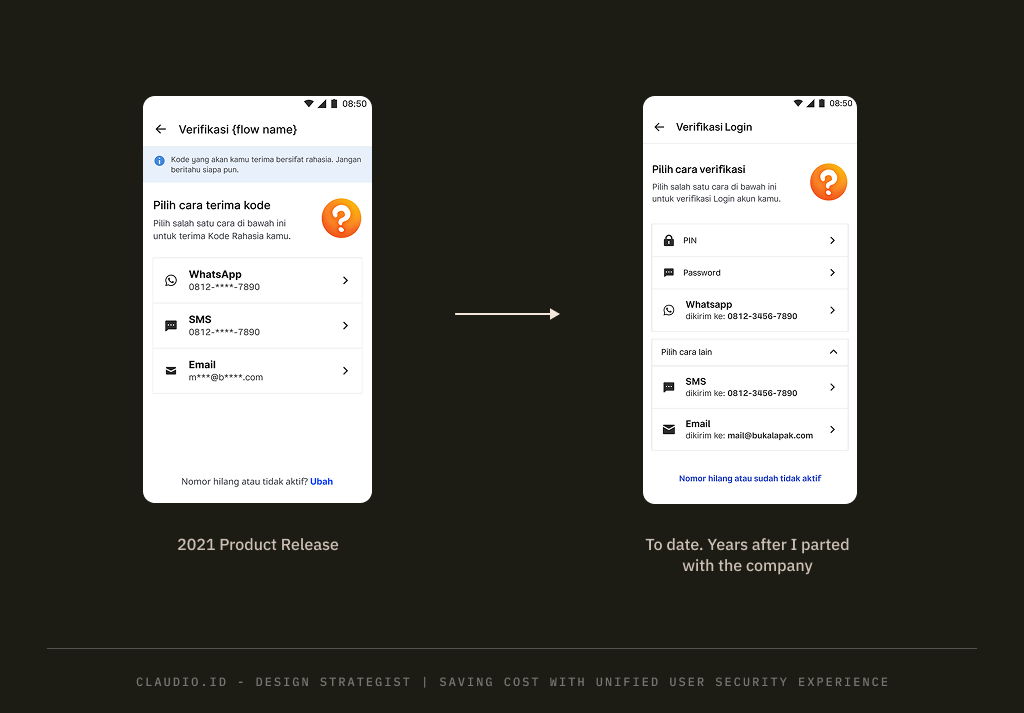
Improved scalability with the evidence of having more features but with little to none design changes since our first release around 2020/2021.
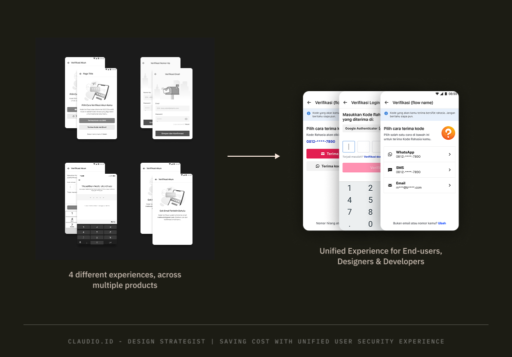
Streamlined the product from 4 different design implementations of the same product intent and reducing them to a single, standardized, and reusable experience.
Centralized design and tech implementation assets for a cohvesive experience and implementation standards across products.
Evaluative post-release product data such as OTP failure rate and security challenge drop-off rate cannot be retrieved. I already parted with the company when this product was released.
Why are we doing this?
Identifying the target users and the product’s expected value will help us define its purpose and vision, and ensure we are addressing the right problem. From the interview during discovery phase, I found:
“Our current product experience has cost risk (budget loss). We want to ensure that every challenge that we sent out, it wont go to waste” — Product Manager
“Whenever I need a security challenge flow to design my product, it’s difficult to tell where I can obtain it” — External Squad Designers
“…during buyer and seller login process, our failure rate for invalid one-time-password (OTP) is approximately 1,06 million cases (from the past 2 quarters)” — Internal Data
“Right now, every squad has different design and approach to implement it (security challenge). Without standards, it’s difficult to control and maintain” — Internal Squad Engineer
Implied hope and fear
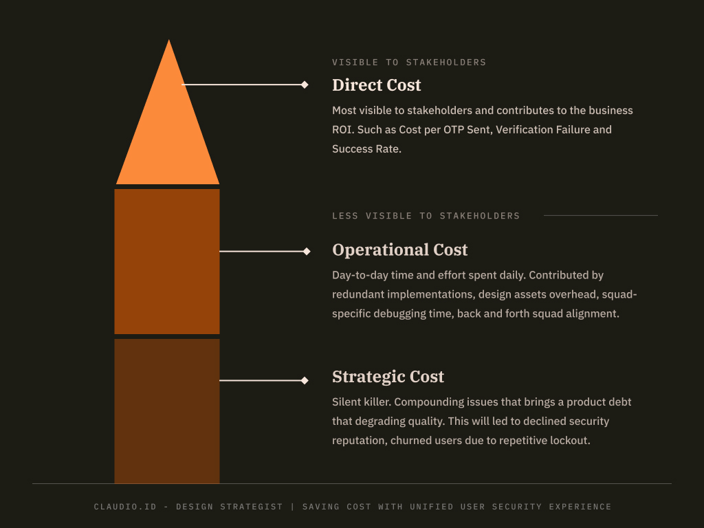
- We pay for every security challenge we sent. That’s why the product need to spend the budget efficiently. Learn more about one time password (OTP)
- Users will got locked out outside the platform, due to the inaccessible OTP code. We don’t want this led to churned users, and higher involvement from customer success team.
- Unorganized security product can led to difficulties to scale and maintain it in the future for the entire Bukalapak product.
- Our current product state is counterproductive on achieving security and reliability as our core values due to the inconsistency. Read why
So what?
In order to translate problems, hope, and fear into tangible solutions, we need to rethink it as a question, and answer them:
“How might we help buyer and seller easily obtaining their account security code?
“How might me make our product easily scale for growth, while keeping the experience predictable to use?
“How might we make our design and product efficient to implement by the external squad?
Design process
The design process will be focusing on finding opportunity according to our product vision, problems in consistency, scalability, and design workflow across squads within company. This design process was done in pre-generative AI era.

Discovery
My goal for this activity is to focus understanding the product vision, finding user pain points, evaluating consistency, scalability, and design workflow.
Product Design Audit
In this stage, I need to find the evidence, why it is important to solve, and how severe the impact for the product both in the short run, and the long run by understanding these 4 aspects.
Data Analysis
To aid in decision-making during the audit process, I also need to obtain past data, both quantitative and qualitative.
After cross-referencing this with our data we found the root cause of users pain points:
Competitor Analysis
One of the approach to balance scalability and usability is by to not reinvent the wheel. Looking at the similar product used by our users can minimize the risk of being not usable, or farfetch to implement.
I collate multiple examples of real world product from direct competitor, indirect competitor, and non-competitor with 4 main focus.
Strategize
Product is continuously evolving. Insights obtained during the product vision understanding with the product manager were many. But within constraints at given time, it is impossible to deliver all of it.
We don’t want to take risk by developing a product that need a long time to deliver. How to deliver it quickly?
Bite-sized deliverables
Agile culture that we adopt is to always deliver value to our users, continuously, and improving over time. With the spirit of Agile, as a designer I also need to think valuable deliveries for our target users in multiple sprint.
But the challenges of delivering product experience into a shorter, quick-win delivery of experience as part of our first phase are:
How might the design can progress towards north-star product vision in each releases?
How might the user can adapt easily everytime product evolves?
How might the design can avoid overhead in the operational and strategic cost?
Scalable design pattern
Ensuring the solution can scale is important to achieve an efficient operational and strategic cost for a sprint-by-sprint release.
My approach for this strategy are:
- Assess extreme scalability of the IA design when all features are presented
- Ensure a little-to-none design and engineering effort when features are added or removed
- Do not reinvent the wheel. Aiming for a high reusable of components and common screens
Straightforward UX writing
I can’t say much about UX writing creative process but what we found as writing problem are:
- Writings are inconsistent across products
- Unclear guidance on the fallback when being locked out
Trade-offs
Nothing is perfect. What I am willing to compromise is the visual may not look as “festive” as the rest of the product. But this is not the goal anyway. The security product must be direct, giving a sense of authority, and be clear about the security challenge reason.
Dealing with the trade-offs
We have to meet in the middle ground somehow. To compromise, I am working together with our UX Illustrator to add a visual cue to our product.
With illustration, it can keep the brand recognized, improve product clarity, and makes it easy to glance on what is this screen is all about. A quick and low effort approach to compromise.
Validate
When the design and plan was created, a sanity check is needed to ensure the deliverable achieving the objectives in given constraints.
Achieving scalability
Stress test was done to ensure all exhaustive options can be accommodated in the design. Reusable design pattern is used for predictable implementation and user experience.
The test will evaluate IA structure, reusable components complexity, and UX writing clarity from possible use cases in both ends of the complexity spectrum.
Involving the engineering team during the project is needed in the early and mid-stage. Engineering involvement act as a subject matter expert consultants for possible edge cases, and to align with the security governance.

For this project, I held a quick think-tank session since we already had the prototype ready. Faster to reiterate and easier to explain with tangible outcome.
Achieving zero usability issues
We want the product easy to understand without major usability issues. What I did was to setup an interactive prototype and static screen prototype to:
- Uncover product clarity issues in the first 5-second impression
- Validate the ux writing clarity on the new OTP messaging
Concept Test and Usability Test was chosen due to the availability of past research results, and low design effort. Protopie and Figma’s Prototype were used in this process.
Reducing operational cost
I consulted with our design system team PIC since I notice that this project outcome will be useful to be added in our design system library.
By having the design documented in the library, whatever updates that our squad released, it will be updated across squad with low effort. Maintaining consistency, reducing overhead of finding the latest design, and make them focus on their product instead.
In the process, I also ask feedback with other product squad’s designer as well for the available use cases that I may not cater during design critique.
Although unfortunately, the only thing that was missing from my sight is that the new OTP flow is also being used to connect Bukalapak account with our sister company’s product. There was a problem on showing the design on their product since they got smaller screen real estate.
To compromise, I had to create a minified design version that hide unimportant information and design elements. Lesson learned. Being thorough on the affected touchpoints in the early stage of project execution is critical.
Product & Design Team
Stefio Kurniadi (Product Manager), Ruth Hutagalung (UX Writer), Labib Ahmadin (UX Illustrator), Rosyid Rizki Fauzi (Design Manager, Direct Report)