Putting the brand in everyone’s hands
3 years of building design system at Spenmo, now Summit Global. Through a halted MVP and two rounds of layoffs, to a rebrand that shipped in 1 month instead of 3, and people starts to published their prototype on-brand with AI.
| Role | Senior Product Designer · Design System Lead |
| Company | Spenmo / Summit Global, B2B expense management SaaS |
| Timeline | Q1 2023 to Q3 2024 |
| Team | 1 designer, 1 writer and 2 engineers, down to 1 engineer after the layoffs |
| Scope of work | Led, researched, directed, delivered and monitored for improvements |
Overview
In 2023, Spenmo launched a new brand, but there was no shared system to carry it into the product, so every screen would have needed restyling by hand. I led the design system that became that connection, measured where it landed, then led the product rebrand on top of it to Summit Global in 2024.
Outcomes
- Pulled by product teams (2023): 19 of 21 component requests from product teams delivered
- Used in the product (Q1 2024): Splice tokens on 9 of 11 core pages within weeks of v1 release, 1,840 uses in total
- Carried the whole rebrand (2024): 100% of the product moved to the Summit brand on Splice. Approval Workflow took about 1 month, compared to about 3 months to build it the first time without a design system.
- Used beyond design (2025-2026): 6 of 30 people, 1 in 5, building on-brand prototypes, released to the end users on Splice with Claude Code
The problem: a brand the product couldn’t wear
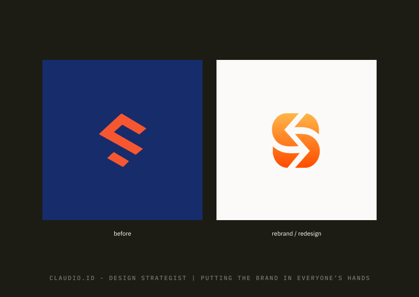
Marketing launched Spenmo’s new brand in Q1 2023. Inside the product, only the logo and the login page changed. Everything else still looked like the old brand.
The reason wasn’t only the effort. The product had no shared system: styles were hard-coded page by page, and each team built its own versions of the same components. Changing the brand meant changing every screen by hand.
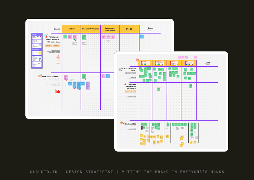
Engineers and designers felt it. In a FigJam session before Splice started, they described what makes them needed a system:
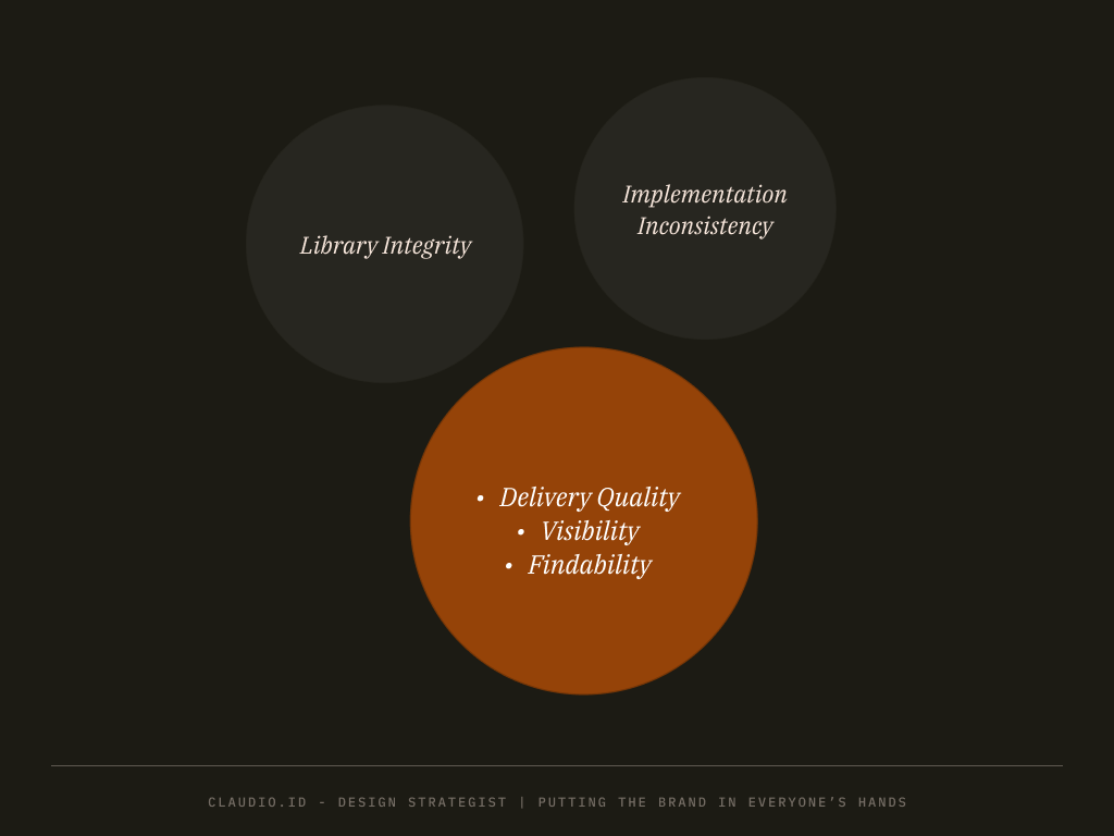
That set the real goal. Before the product could be rebranded, it needed something that could carry a brand: shared tokens and components every team builds with. That became Splice, with one mission:
Deliver a system that helps engineers and designers produce a high-performance product at a lower cost.
Act 1: Building the vehicle (2023)
We shipped Splice v1 in a year that lost a quarter to a halted MVP and a round of layoffs. Within this year, we managed to have big-bets company initiatives to adopt the Splice library.

Q1: Foundations
I delegated the preliminary audit and naming to Melia, who grouped the existing components and each of its issue and proposed solution for it.
Building on her work, I mapped each component, from color and spacing up to data tables, against its Ant Design equivalent and any legacy design, then sized it by effort and impact. Nearly half had no design version at all.
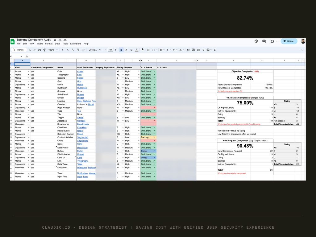
The audit then became our tracker: by Q2, 30 of 40 components were in the library (75% against a 70% target), and 19 of 21 requests from product teams were delivered. Meanwhile, I defined the Splice initiative and its design standards, then formed the foundations: color, type, spacing, radius and elevation.
Q2: MVP, then a halt
The design system team became official and the MVP started. Then the company paused it for a higher-priority project.
This is what I protected; whatever foundation we already built, must be implemented in whatever higher-priority project we need to follow. This is important and strategically beneficial for us to test the water and show the impact to the stakeholders.
Q3: Staying relevant.
This is where things went interesting. I managed to have the Splice adoption to the company’s big bets: the new sidebar and homepage rather than staying still stopping all design system activities due to the shift in company’s strategy.
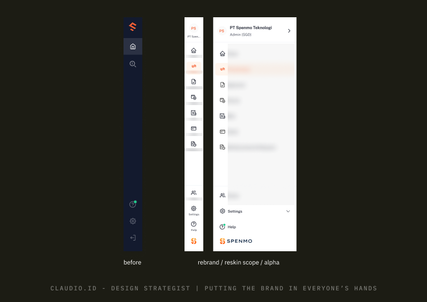
Those two are selected because it is the most visible, visited, interacted component and pages by our user. The MVP shipped through that work. Then layoffs cut the team down to 1 designer and 2 engineers.
Q4: Recalibrate and finish.
I reset the target to what a smaller team could ship: 11 components across four two-week sprints, 30 Oct to 22 Dec. More front-end engineers joined, and we shipped 100% of the recalibrated target.
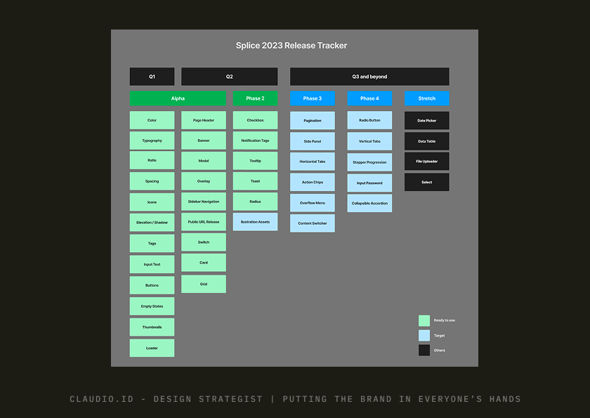
Prioritization was simple. Pick the most used components, and starts from the basic where the dependencies are low.
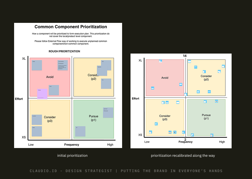
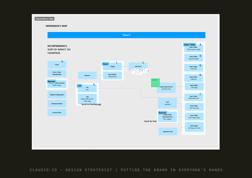
The call I’d point to: tying Splice to the big bets instead of competing with them for time. It kept the system alive, although when priorities moved.
Act 2: Measuring where it landed (Q1 2024)
Shipping a library doesn’t mean the product uses it, so in early Q1 2024 I measured adoption page by page. Tracking components needed tooling we didn’t have yet, so I chose token usage as the metrics instead.
I delegated the counting to Ritik, who wrote a script that found every place a page used a Splice color, type, spacing, radius or elevation value.
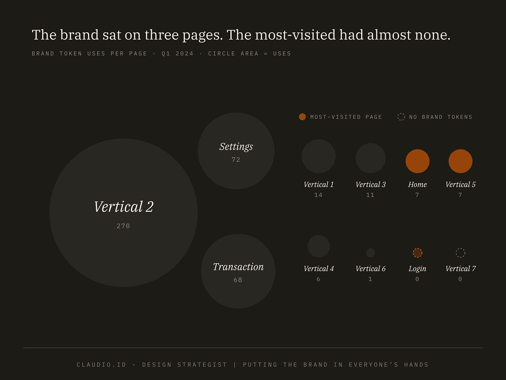
Weeks after v1 shipped, Splice was on 9 of 11 core pages. The most-visited page such as had little-to-none. The good thing is our main verticals are still sit at the top of the coverage usage. The concerning piece is, only 1 out of top 3 verticals are getting Splice adoption significantly.
This telling us that adoption is there, massively adopted, but need to be better in spread. This is why for the next improvements, we will focuses more on the most visited page instead, and align with company big-bets so the top priority verticals are getting higher adoption rate.
What the baseline changed
- Most visited page prioritized to the top of the adoption list.
- The card color token, used only twice in the whole product, was removed from the library.
- Usage reporting became a monthly and quarterly ritual in #design-system Slack channel.
- Component-level tracking became the next metric measurement tools to build.
In hindsight, the baseline was also a rebrand-readiness map. Pages built on tokens would repaint when the brand values changed; pages without them would need rework.
Act 3: Rebranding the product as Summit (Q3 2024)
The whole rebrand ran for about 3 months: implementation started in Q2 2024 and Summit launched in July 2024. With Splice in place, I led the product design direction for Spenmo’s global rebrand to Summit: translating the new brand and its communication into product UI.
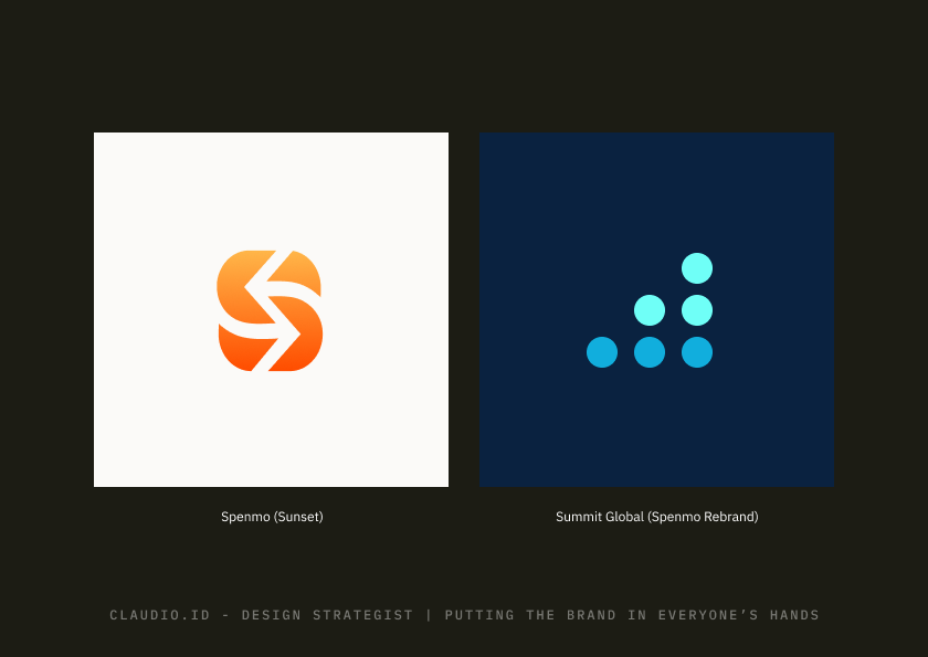
Getting it released means 100% of the product translated by multiple engineers working on different parts at the same time, and Splice gave all of them the same tokens and components to build with.
One success example I can share is our Approval workflow product moved to the Summit brand with a new design in about 1 month, logic and tech debt included. Compared in 2021 without a design system, the product had taken about 3 months to finish since everything needs to be built from ground up.
What is derived: Brand color, Tone of voice
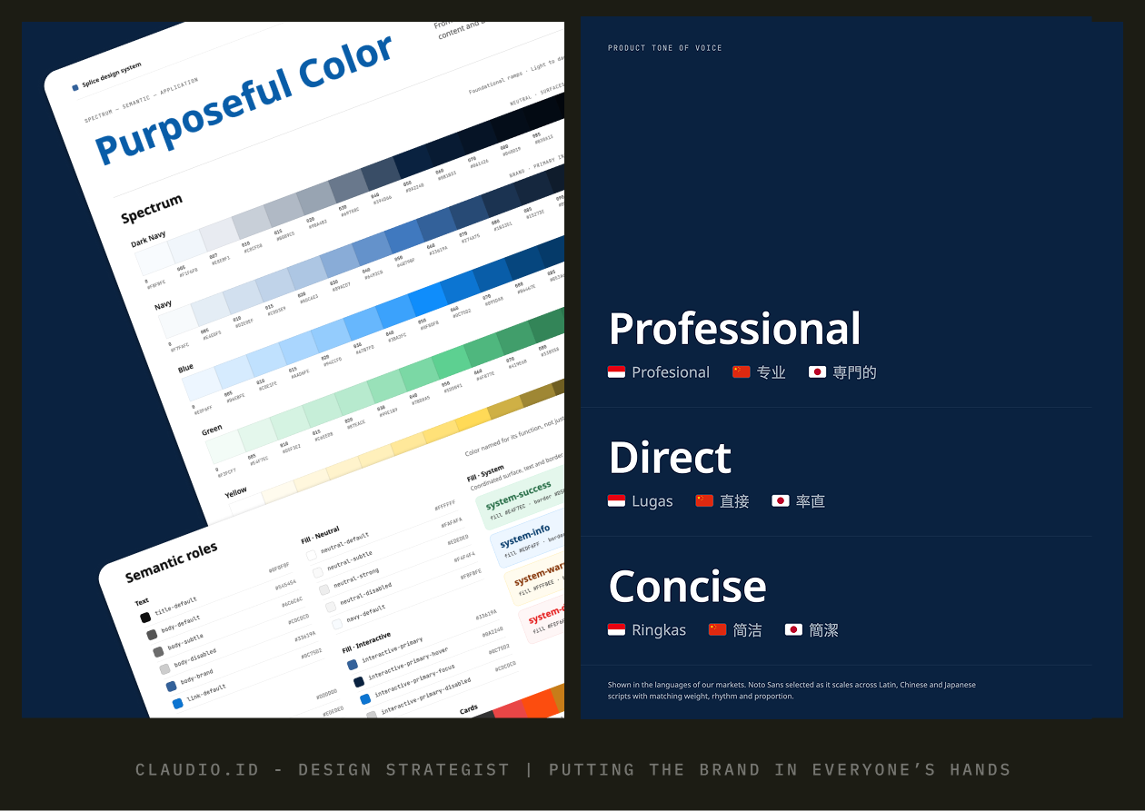
What had to change for product: Typefaces, Density for data tables, Status colors, Navigations, Product design principles, Iconography & Illustrations, all in-product assets that marketing was never designed.
How it shipped: Migrating pages one by one, focus on the new projects and down to the each of most critical verticals; design token toggle for internal workflow
What I monitored after launch: After the rebrand, I ran guerrilla 1-on-1 chats with engineers about what was still blocking them. Most blockers came down to one thing: components weren’t flexible enough for real backend data, like granularity of loading states and long lists that needed to be searchable when populated.
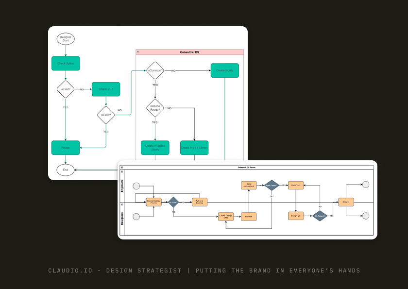
What I improved from that data: Splice shipped with a contribution model: engineers could adapt a component locally as a “snowflake,” and once a second product needed the same change, we promoted it into Splice for everyone. Searchable dropdown was the first to go through it. Those patterns became the roadmap for Splice 2.0, which the company shut down before we could ship.
Act 4: Scaling with AI (2025 — 2026)
Once AI tools arrived, PMs and engineers at Spenmo could build an on-brand product prototype
AI on its own produces screens that look plausible but don’t match the product, so they get thrown away. With Splice in place, every prototype was built from the same tokens and components. Product and design stayed aligned without me reviewing the design system implementation of all screens.
- Tools: Claude Code, building on the Splice library. PMs used their prototypes as working specs to hand to engineers.
- Proof point: 6 of the 30 people that I know of prototyped this way. Two examples: one of my own prototypes went straight into build after using it in multiple round of market testing demo by our C-level to our client. Now claimants can report in bulk and asking for a pre-approved expenses. And an engineer built a PDF Splitter for Invoice on their own, and it needed only one design iteration to polish the experience.
This was the last piece of the workflow. The system built for a rebrand became the shared language that let the whole company design.
Reflection
The rebrand didn’t ship when marketing launched it. It shipped when the system could carry it.
- 2025: Another round of layoffs. While the team shrank, the system stayed alive. We continued to use it in our day-to-day workflow to build product on top of it with minimal changes in the library. That proves the system works and covers most needs for shipping a usable product.
- What I’d do differently: Set up automatic adoption tracking from day one, instead of counting by hand after launch. I thought tracking would be easy by doing it from code side, but it’s not.
Team
Melia Pradita, Zara Zahrina, Ritik Pratni, Hare Krishna
Honorable mentions:
- Anthony Kevin, for trusting me holding the fort as Design System Lead for Spenmo at the first place
- Yun Fang, Elfin, and Marketing team for their great work and communication during rebranding project
- Sushmita, Bakshi, Ieuan, Semmi, and Rohan for contributing to Splice while handling the product & rebranding effort at the same time
- Lam, for setting up the infrastructure that put the shared library on an internal URL for everyone
- Kai, for thoroughly translating a huge number of invoice pages to the new brand and becoming a great mentor for me during a hard time
- Hammad, for pressure-testing our assumptions, which pushed us to sharpen the reasoning behind visual direction